You’re probably a product manufacturer or a designer. And you believe in the maxim—first impression is the last impression.
Product Packaging design is the first thing people notice about a product. It plays an important role in attracting consumers. So you wish to impress them at the very first glance of your product.
And the theory is simple!
Why do you always wrap your gifts in a wrapping paper? Because it makes them look attractive, right?
Same applies to your products. The packaging makes the potential customers hold your product and spend some time with it. It might be to look at its design, grab an offer, or read details such as its ingredients.
And the more time they spend with it, the higher are their chances of making a purchase.
So the question is—how do you make your product packing design stand out? How do you make sure it does not only meet the customers’ eye but also makes them confident about making a purchase?
Here’s an exhaustive list of ten ways you can design your product packing and make it stand out:
A. Give your consumers a visual treat
Say you wish to buy perfume. You go to a store where you see a number of similar perfumes on a shelf. And then you notice a perfume bottle designed like a bamboo. What will you do?
Pick it to at least check its fragrance, right? And if you like it, you might even buy it.
An uncanny product packaging will always catch attention. That is, people generally like products that have out of box packing or colors.
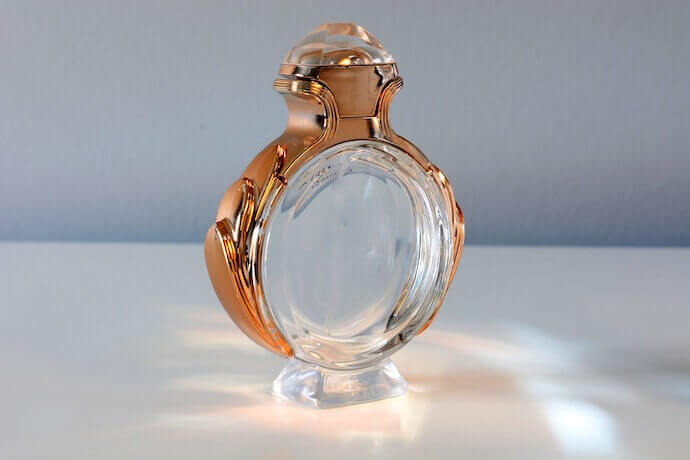
Vacuum sealed products or products with a particular pattern catch eyeballs. So do the ones with packaging that conveys what the product is or what it does.
So consider making your packaging design unique in its own way. You can even use things of daily use to do that, For example—a newspaper to cover your products. It will give an ethnic, retro look to your product
B. Use the right color codes
Colors are another important aspect of the packaging. They have an emotional appeal. They do not only create a theme for your packaging but also convey trustworthiness of your brand. How?
According to color psychology, the more colors you use on your product, the non-serious the product looks.
So make sure you only use the ones that clearly convey what you do and meet your purpose the best.
For example—if you’re into the food industry, colors such as red and yellow will work best for you. They’re appetite stimulants and make consumers feel good about what they are buying.
Similarly, if you’re designing packaging for products of sophistication and prestige, you can use black color. And that is the reason why most smartphones have a black handset.
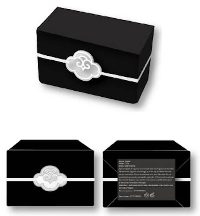
The combination of red and black in product packaging is much liked by Spanish people.
C. Use the right kind of image
The next comes—images. Put an image that shows your product the best. It can be your company’s mascot or even the product image.
For example—most smartphone packagings have a high-quality image showing the phone. And many food packagings feature their mascots. For example—Amul, a dairy brand in India, has its mascot on its butter packagings.
The main idea here is to help the consumers know what is inside the packaging. Or even make them receptive to your brand (as in the case of mascots).
In fact, you can even consider adding no images at all. Many manufacturers are doing it already. How?
They give a transparent packaging to the product. This helps consumers see the product directly through its packaging.
Whatever images you put, make sure they attract consumers in one or the other way.
D. Show important information
Now that you’ve decided how the packaging will look like, what colors and images you’ll use, think what information will you add on it.
For example, most of the consumers check the expiry date in terms of food products. For an electrical appliance, consumers check instructions and precautions.
Consumers generally look for product information before buying it. These details should be displayed with the utmost honesty. Some of these details include:
1. Product summary
2. The size of the product
3. The composition, (in case of food products, ingredients)
4. The date and place of manufacturing
5. Safety instructions (including warnings)
6. The exact weight
7. Name and address of the manufacturer or importer
These are the fundamental details every consumer wants to know before making a purchase. They do not only tell them what they’re buying but make your product trustworthy.
E. Add all the details but don’t clutter
Say you want to buy multigrain biscuits. There are many brands in the market that offer a similar product at competitive prices, right? How would you then decide the best one?
Probably by reading its details. But all the variants will have the basic details such as nutritional information. What will you then do?
The answer is—select the one that stands out from the crowd. The one that tells you everything you need to know. The one that provides you detailed product information.
It’ll not only make your product unique but also help you gain consumer trust.
But as discussed, limited printing space can keep you from doing it. However, you can still provide all the details you want without consuming much printing space. How? With a QR Code.
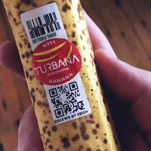
We call it a Product QR Code. A Product QR Code can store text-based details such as nutritional information and user-manuals.
And it can even show multimedia content such as images as video to end-users. For example—an infographic or a video tutorial on how to use your product.
Such details are otherwise impossible to be added to the limited space on your product packaging. Many manufacturers are using it already.
And your customers just need a smartphone to scan the QR Code. That simple.
You might think—a black-and-white QR Code will not blend well with my packaging design? Don’t worry, you’re not alone.
You can actually customize your QR Code by adding your brand’s logo and mascot to it. And it is a fact that customized QR Codes attract 50-70% more scans than standard black and white ones.
F. Keep your product utmost consumer-friendly
For this, you need to know your exact target audience. That is— your product is for women or men, kids or adults or is universal across gender and age.
And then package your product in such a way that it takes care of your respective audience.
For example, if your major buyers are old age people— use large font size and bold colors. Your product should obviously appeal to your target consumers.
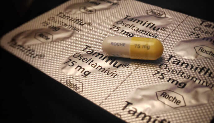
If your brand sells luxury products, then add the right amount of elegance and royalty. This will surely pull your affluent customers.
G. Tell them that you care
People today are concerned about environmental health, right? So firstly, make sure you follow best practices to keep the environment safe and healthy.
For example—try to make your product recyclable. And avoid using plastic as much as possible.
Next, make sure the product packaging design clearly conveys that ‘ you care’. Consumers tend to buy products that are eco-friendly.
And what does it take to signify both consumer and environment-friendly products? The color green.
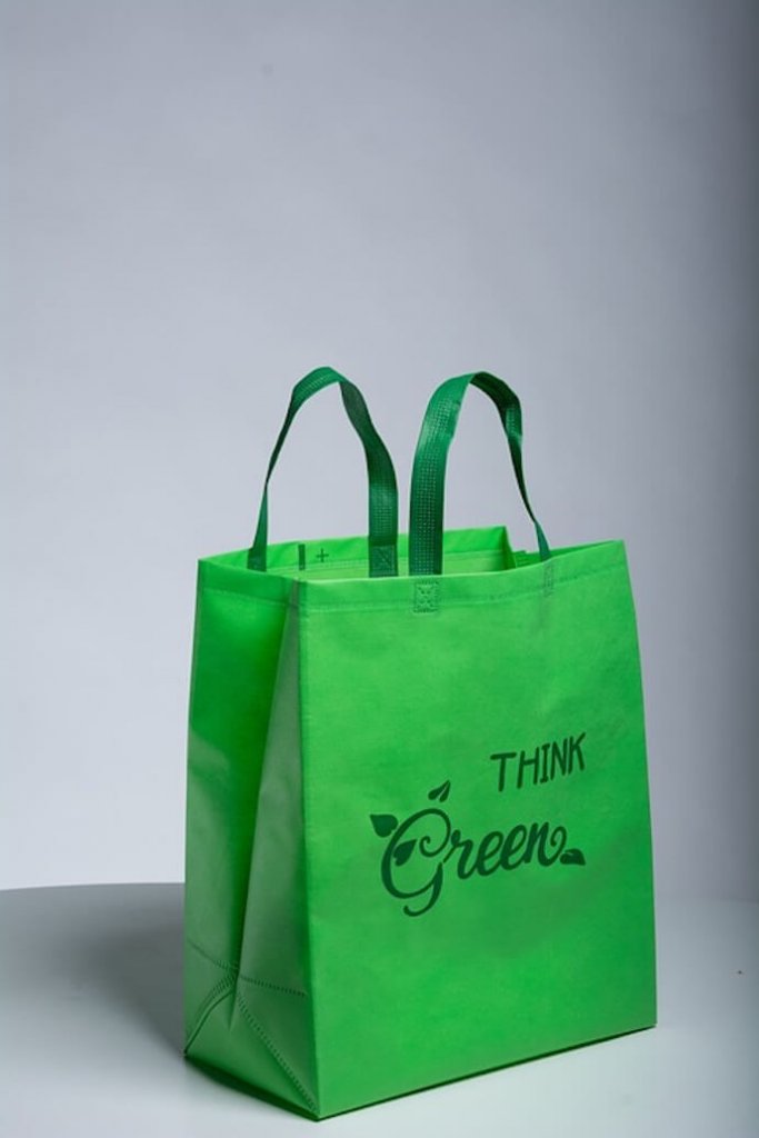
So you can add a light green design to your product will make you seem an environment loyalist.
In fact, you can even mention any social issues that you truly care and do something about. For example—child education and poverty.
Such small additions give your product a soothing, subtle and soft spectacle. Quite simple, right?
H. Make your product packaging look branded
Make sure your packaging design looks branded. Why? It will help make consumers receptive to your brand.
For example, Apple, an American multinational tech giant, uses its logo on each of its products such as phones and laptops.
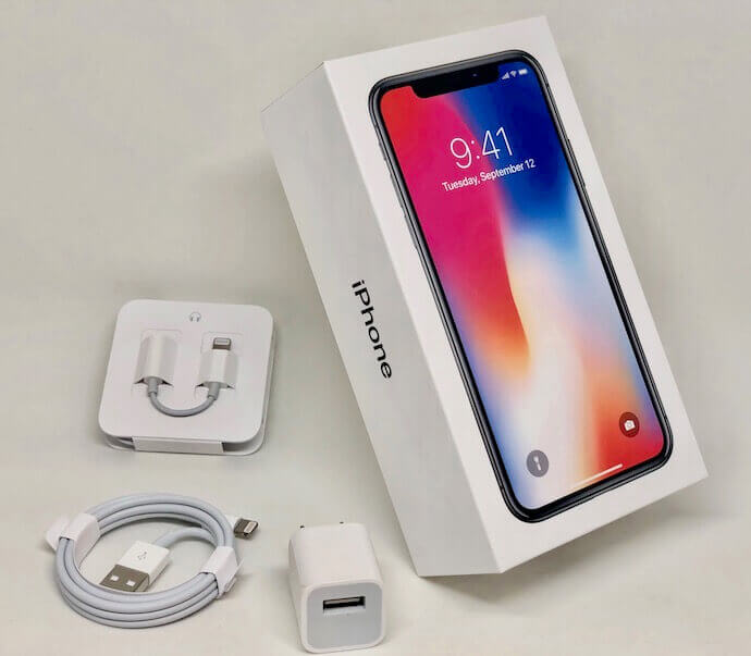
Similarly, writing a logo for your product can catch eyeballs. You must have seen people remembering a brand’s name through its logo. This is how powerful it can be on your product packaging.
I. Get feedback on your product design
Before you finalize your product design, take feedback. These reviews can actually strike some great ideas in your mind.
Ask your coworkers, neighbours or people least connected to the product about the packaging.
You can put up questions such as—what does the packaging make you think the product is used for?
Or who do you think will buy it? Or your first impression of the product.
The answers to these questions will help you gain useful insights about your product packaging. Some of these include—whether it is actually communicating what it ought to. Or is it in harmony with the ideal consumers?
J. Protect your product packaging until it sells
Designing and customization are important but the foremost thing is to protect your product.
If you are selling your product online or in a store, keep in mind the time it will take to reach the destination.
If your product is slow-moving (or takes months or years to reach the final consumer), package it appropriately. Your product ought to withstand all the elements until it reaches its final consumer.
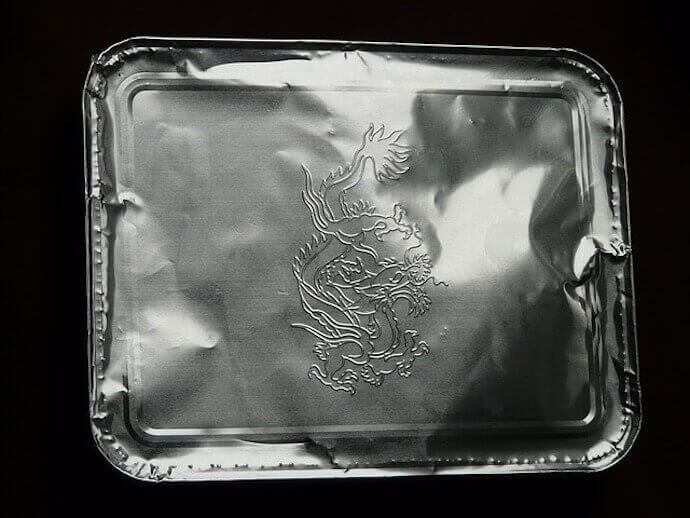
For example, fragile goods such as electronics are packaged with appropriate shock-absorbing material.
That’s it. These are ten ways you can make your product packaging design stand out.
A good design is the one that not only meets the consumers’ eye but also enthuses them to spend some time with it.
